Silverlight Line Graph with Gradient
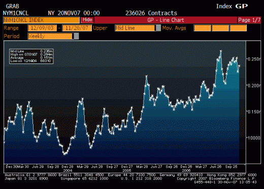
I have a series of points which I will turn into a line on a graph. What I want is to give the area under the graph a gradient fill. It would look somewhat similar to a Bloomberg graph like this;

My question really has开发者_如何学JAVA three parts;
- First, how should I fill only the area under the graph?
- Second, how do I fill that with a gradient?
- Finally, if I have multiple lines on the same graph any area under more than one line should have a greyscale gradient fill, how would you set this up?
My biggest problem is deciding on the data structures to use, I could use many multiple sided shapes (One for each line/ data series) and then tell the brush to draw;
- Transparent if it's not in any shape
- The colour of one series if it's in one shape (Alpha relative to height to give grad)
- Black if it's in multiple shapes (Alpha relative to height to give grad)
Then I'd draw the shapes' boundaries in white afterwards.
Thanks,
Gav
The gradient effect is possible using the free version of Visiblox Silverlight Charts. See the example application 'Hindsight' to see how Visiblox charts can be applied to an application of this context.
I've attached a crude code snippet of the XAML on how to achieve this effect:
<UserControl x:Class="SilverlightApplication1.MainPage"
xmlns="http://schemas.microsoft.com/winfx/2006/xaml/presentation"
xmlns:x="http://schemas.microsoft.com/winfx/2006/xaml"
xmlns:mc="http://schemas.openxmlformats.org/markup-compatibility/2006"
xmlns:v="clr-namespace:Visiblox.Charts;assembly=Visiblox.Charts">

<UserControl.Resources>
    <LinearGradientBrush x:Key="GradientBrush" StartPoint="1.0, 0.0" EndPoint="1.0, 1.0">
        <GradientStop Color="AliceBlue" Offset="0.3" />
        <GradientStop Color="DarkBlue" Offset="0.7" />
    </LinearGradientBrush>
</UserControl.Resources>

<Grid x:Name="LayoutRoot" Background="White">
    <v:Chart x:Name="Chart">
        <v:Chart.Series>
            <v:LineSeries x:Name="Series" ShowArea="True" AreaFill="{StaticResource GradientBrush}"/>
        </v:Chart.Series>
    </v:Chart>
</Grid>
Personally, I would take the action that Hindsight does, removing the area under lines when there are multiple series on the plot area. I think at that point the gradients get in the way of the data, and as you mentioned above, to do something about this incurs a computational cost. This could also lead to misinterpretations of the data so be wary.
In terms of getting your data to the chart, you can use the Visiblox BindableDataSeries to bind your business objects directly onto the chart. :)
Disclosure: I have previously worked as a developer on Visiblox Charts.
Hope this helps!
 加载中,请稍侯......
精彩评论