Google Visualization Annotated Time Line, removing data points
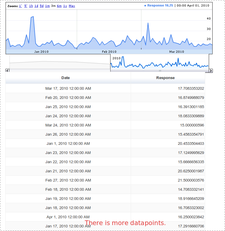
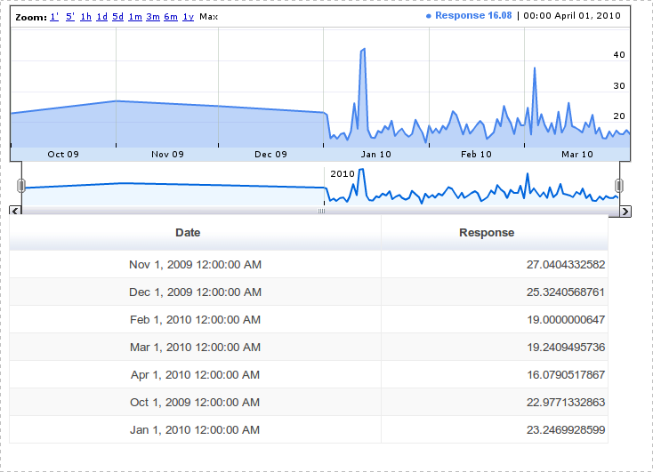
I am trying to build a graph that will change resolution depending on how far you are zoomed in. Here is what it looks like when you are complete zoomed out.


The tables below the graphs are table display what is in the DataTable. This is what drawing code looks like.
var g_graph = new google.visualization.AnnotatedTimeLine(document.getElementById('graph_div_json'));
var table = new google.visualization.Table(document.getElementById('table_div_json'));
function handleQueryResponse(response){
    log("Drawing graph")
    var data = response.getDataTable()
    g_graph.draw(data, {allowRedraw:true, thickness:2, fill:50, scaleType:'maximized'})
    table.draw(data, {allowRedraw:true})
}
I am try to find a way for it to only displaying the data that is in the DataTable. I have tried rem开发者_如何学Gooving the allowRedraw flag but then it breaks the zooming operation.
Any help would be greatly appreciated.
Thanks
See also
- Annotated TimeLine when zoomed-out, Too Many Datapoints.
you can remove the allow redraw flag. In that case you have to put the data points manually in your data table
- The latest date of the actual whole data
- The most outdated date in the actual whole data.
this will retain your zooming operation. I think you have already seen removing the allowRedraw flag, works but with a small problem, flickering the whole chart.
It seems to me that the best solution would be to draw every nth data point, depending on your level of zoom. On the Google Finance graph(s), the zoom levels are pre-determined at the top: 1m, 5m, 1h, 1 day, 5 days, etc. It seems evident that this is exactly what Google is doing. At the max view level, they're plotting points that fall on the month. If you're polling 1000 times a day (with each poll generating a single point), then you'd be taking every 30,000th point (the fist point being the very first one of the month, and the 30,000th one being the last point).
Each of these zoom levels would implement a different plot of the data points. Each point should have a time stamp with accuracy to the second, so you'll easily be able to scale the plot based on the level of detail.
 加载中,请稍侯......
精彩评论