Hide or Disable? In this example and in general
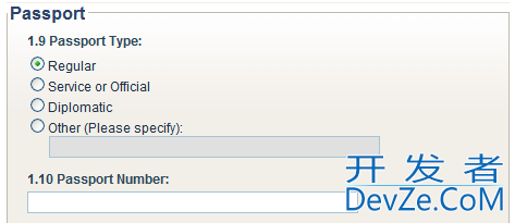
I have the following set of controls.

Scenario 1:
If you select one of the first 3 radio buttons and click enter, focus will jump to the Passport Number text box. If the user selects "Other", the "Other, Please Specify" textbox is enabled and, for convenience, screen focus (the cursor is moved) to that textbox.
Scenario 2:
The "specify Other" text box is hidden until the user clicks on the Other Radio button. Upon doing so, the textbox is made visible and the cursor is placed in this textbox.
Which scenario do y开发者_Python百科ou feel is a better approach? Perhaps you have another variation? Please state your reasoning.
I would also appreciate it if you could make a generalized statement as to when hiding is better than disabling or vice versa, but I am also interested in this particular example.
Thanks.
Afetrthought: Perhaps, in the 2nd example, the "Please Specify" text would only appear after the user has selected the 'Other' radio button.

I find that changing the UI by hiding/showing controls can be quite jarring and confusing to the user. Go with option 1 and enable the textbox when the appropriate radio button is checked.
My initial impression is that number 1 is neater.
- it allows for a clear design of the GUI (there wouldnt be inexplicable empty spaces in the input screen)
- it makes the colon after the `(Please Specify)" request meaningful.
The only time I advocate hiding UI elements is when it improves the UI. If it's just 'different' rather than 'measurably better', don't do it.
Users may be put off by the fact that the "other" option seems to require that you specify something, yet the UI gives no clue that you can do that.
I would consider number 2... Hiding the text box will make it easier for the majority of people to run their eye down the page (each horizontal line creates a barrier for the eye). When someone selects 'other' a text box could fade in with the words 'please specify' in the box. The form will seem to respond to the users input.
 加载中,请稍侯......
精彩评论