How to Anti-Alias Layers in iPhoneOS
We've had Reiner Knizia's Money开发者_开发百科 out for a couple of months now. It's done pretty well, and so we've been updating it as time allows. However, one thing continues to bug me. I've never been able to get my layered cards to anti-alias correctly.
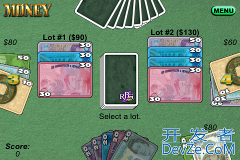
Here's a sample:

Cards that are laid straight are very clean, but whenever they're angled the black lines around the cards get jagged. I've tried this depending on both lines implicit to the artwork and lines drawn through drawRect:, and they both do the same thing. I've tried the edgeAntiAliasingMask and it doesn't do a thing as far as I can tell. I've tried masksToBounds for the sublayers set to NO and YES.
Right now my card is set up as a CALayer that has sub-CALayers for the front and the back, plus for a few other things like a lightening mask and a darkening mask. Here's some snippets of the code:
   CArdLayer *theCardLayer = [CArdLayer layer];
   theCardLayer.edgeAntialiasingMask = kCALayerLeftEdge | kCALayerRightEdge | kCALayerBottomEdge | kCALayerTopEdge;

   theCardLayer.front = [CALayer layer];
   theCardLayer.front.edgeAntialiasingMask = kCALayerLeftEdge | kCALayerRightEdge | kCALayerBottomEdge | kCALayerTopEdge;
   theCardLayer.front.bounds = theCardLayer.bounds;
   theCardLayer.front.masksToBounds = YES;
   theCardLayer.front.contents = (id)[cardDrawing CGImage];

   [theCardLayer addSublayer:theCardLayer.front];
Etc ...
Any ideas on how to make the cards actually anti-alias?
This has the effect of adding a transparent border:
layer.cornerRadius = 1.01;
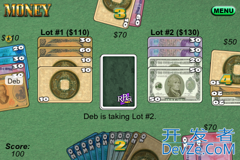
The best result that I could come up with was by doing what I suggested in my comment: I grew each (transparent) graphic by 1 pixel on each side. With that little bit of margin, the cards composited much better with the background.
So, not exactly an iPhone code answer, but one that nonetheless works on the iPhone.
Here's an "after" shot that you can compare to the "before", above:

I never used the framework, but it looks like the anti-aliasing works only on the inner side of the card, not on the outer side (assuming the rounded corners on non-rotated cards are a special case).
So IMHO it actually is a composition problem of cards and background.
A quick view to the docs offers some hints (only assumptions, try them):
Make sure Opaque property is false (maybe what you see is the result of an optimization of the rendering code).
Check what it looks like if you set Opacity to "near opaque" (maybe 0.9?).
Check the Mask property. It should allow you to create a mask like an alpha channel, with soft borders - though I know its not really what you want...
If you don't want to fire up photoshop, here's a way that you can do it programmatically:
http://vocaro.com/trevor/blog/2009/10/12/resize-a-uiimage-the-right-way/
Specifically the -transparentBorderImage: category method in UIImage+Alpha.h/.m.
Hope this helps others out there.
Thanks http://vocaro.com/trevor/blog!
 加载中,请稍侯......
精彩评论